

A beauty brand visual identity is the curated system of visual elements designed to communicate a brand's core message consistently across every touchpoint. This system goes far beyond a logo. It includes color, typography, imagery, packaging, and digital presence working together as one coherent expression of who the brand is. Consistent visual branding across all touchpoints increases company revenue by up to 23%. That number alone reframes visual identity from a design exercise into a business decision. Color is the single most critical element: effective color use can boost brand recognition by up to 80%. For brand strategists and marketers in the beauty industry, building this system with intention is not optional. It is the foundation of every sale, every scroll, and every shelf moment.
What makes up a beauty brand visual identity system?
Visual identity is a system that encompasses logo, color, typography, imagery, and layout to consistently reflect brand personality. Each element carries weight on its own. Together, they create recognition that no single asset can achieve alone.
The core components of a complete visual identity system include:
- Logo: The primary mark, including variations for light and dark backgrounds, horizontal and stacked formats, and minimum size rules.
- Color palette: Primary, secondary, and accent colors with exact hex, RGB, and CMYK values for print and digital consistency.
- Typography: A defined type hierarchy covering headlines, body copy, captions, and call-to-action text, with licensed font files included.
- Imagery and photography direction: Rules for lighting style, model casting, background treatment, and retouching standards.
- Packaging design: Structural format, material choices, label layout, and finish specifications that carry the brand into physical retail.
- Digital presence: Website UI patterns, social media templates, email layouts, and e-commerce product image standards.
The distinction between visual identity assets and visual branding strategy is one most teams blur. Assets are the files. Strategy is the governance system that dictates how, when, and where those files appear. Without strategy, assets drift. With it, every touchpoint reinforces the same message.
Brand guidelines documents span 30–80 pages and cover detailed rules to prevent brand drift over time. A thin, two-page style sheet is not a brand guidelines document. It is a starting point. The full document addresses misuse cases, partner co-branding rules, seasonal adaptation limits, and approval workflows.

Pro Tip: Map your color palette for dark mode from day one. Dark-mode mapping requires adjusting color brightness by approximately 20% to meet WCAG accessibility standards. Skipping this step means your brand looks broken on half the screens your audience uses.
How does brand philosophy shape visual decisions?
Successful beauty brand identities stem from a philosophical foundation that informs every tactical design decision. Philosophy is not a mood board. It is the answer to one question: what does this brand believe about beauty, and how does that belief show up in every pixel and package?
CÎME, a Belgian skincare brand, built its entire visual language around the concept of a "soft gaze." That philosophy dictated everything: the weight of the logo (light, not bold), the photography style (diffused light, no hard shadows), the typography (rounded, open letterforms), and the packaging finish (matte, tactile). Every element reinforced the same emotional idea. The result is a brand that feels coherent even before a consumer reads a single word.
"A beauty brand's identity must make the brand's personality tangible through design decisions, from logo weight to photography angles. When philosophy drives execution, every element speaks the same language."
The Phoney Club on their approach to CÎME
Vivantis, a European beauty retailer, took a different philosophical route. Their rebrand centered on a "best friend" communication concept. The visual identity became warm, direct, and conversational. That shift in philosophy produced a 30% increase in sales within five months of launch. The lesson is clear: philosophy is not soft strategy. It produces hard results.
Balancing science and sensoriality creates differentiation in the saturated beauty market. Brands that lean too far into clinical aesthetics feel cold. Brands that lean too far into luxury feel untrustworthy. The brands that win combine ingredient integrity with sensory appeal, communicating both the efficacy and the pleasure of the product in the same visual moment. Luméra's positioning strategy by The Bract Agency demonstrates exactly this balance, using warm gold tones alongside clean typographic structure to signal both luxury and science.
Meaningful storytelling across touchpoints is what keeps a philosophy alive beyond the launch campaign. When the philosophy lives only in the brand deck, it dies at production. When it lives in the photography brief, the packaging copy, and the social media grid rules, it compounds.
How do you build a visual identity for a beauty brand, step by step?
Building a visual identity requires three prerequisites before any design work begins. First, define your audience with specificity. Not "women aged 25–45" but "women who treat their skincare routine as a daily ritual and read ingredient labels before they buy." Second, articulate your unique brand proposition in one sentence. Third, conduct a competitor visual audit to identify white space in the visual category.
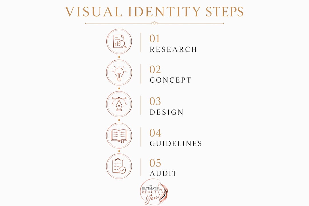
Once those foundations are in place, the development process follows a clear sequence:
- Define color and typography. Select your primary palette based on the emotional territory your brand owns. Choose type families that match the weight and tone of your brand voice. Test both at small sizes and on packaging mockups before committing.
- Refine the logo. Develop the primary mark, then build all required variations. Test every version at the sizes it will actually appear: a 16px favicon, a 300px social avatar, a full-bleed billboard.
- Design packaging. Treat packaging as the brand's primary physical ambassador. Structure, material, finish, and label layout all carry identity signals. Pilgrim, an Indian beauty brand, used packaging design to tell regional ingredient stories, connecting the product's origin to its visual presentation.
- Create digital assets. Build social media templates, website UI components, and email headers that apply the identity system to digital formats. Maintain visual hierarchy across all screen sizes.
- Compile the brand guidelines document. Document every decision, every rule, and every misuse example. This document is the brand's operating manual.
- Conduct a pre-launch audit. Review every asset against the guidelines before anything goes live. Catch inconsistencies at this stage, not after production.
| Development stage | Key output | Common failure point |
|---|---|---|
| Strategy and prerequisites | Brand brief, audience profile | Skipping competitor visual audit |
| Color and typography | Defined palette with technical specs | Missing dark-mode and print variants |
| Logo refinement | Full logo suite with usage rules | Only one logo format delivered |
| Packaging design | Structural and label specifications | Treating packaging as separate from identity |
| Digital asset creation | Template library for all channels | Inconsistent grid and spacing rules |
| Brand guidelines | Complete 30–80 page document | Thin style sheet mistaken for full guidelines |
Quarterly audits help catch brand drift across website, social media, packaging, and marketing materials. Schedule them. Put them in the calendar. Brand drift does not announce itself. It accumulates quietly across vendor-produced assets, seasonal campaigns, and platform-specific adaptations until the brand no longer looks like itself.
Pro Tip: The most common launch mistake is releasing assets before the guidelines document is complete. Teams start producing content using early-draft files, and those files become the de facto standard. Finish the guidelines first. Release assets second.
Why do packaging and digital presence define brand perception?
Packaging is the most underrated carrier of brand identity in the beauty category. A consumer holds a product for seconds before deciding to buy. In that moment, the packaging communicates quality, values, and personality faster than any campaign. The structural format, the label hierarchy, the finish, and the material choice all speak before the consumer reads a word.
Key packaging and digital identity decisions that directly affect consumer perception:
- Visual hierarchy on pack: The brand name, product name, and key claim must follow a clear size and weight hierarchy. Cluttered packaging signals a cluttered brand.
- Photography direction for e-commerce: Product images on a white background are table stakes. Lifestyle imagery that matches the brand's photography style is what builds emotional connection at the point of purchase.
- Social media grid consistency: The grid is a portfolio. Every post either reinforces or erodes the visual identity. Define a grid strategy before publishing, not after.
- Website visual language: The website must apply the same color, type, and imagery rules as the packaging. Disconnects between physical and digital presentation break consumer trust.
Vivantis's rebrand produced a 30% sales increase within five months. That result came from a complete identity overhaul that aligned packaging, digital presence, and communication tone under one coherent philosophy. No single touchpoint drove the result. The system did.
Visual identity must align with specific business goals beyond aesthetics to be effective in competitive markets. A beautiful brand that does not convert is a design project, not a business asset. Measure the identity's performance through brand recall studies, social engagement rates, and conversion data at key digital touchpoints.
Key Takeaways
A beauty brand's visual identity is a strategic system, not a collection of design files. Every element must serve the brand's philosophy and business goals simultaneously.
| Point | Details |
|---|---|
| Visual identity drives revenue | Consistent visual branding across all touchpoints increases revenue by up to 23%. |
| Color is the highest-impact element | Effective color use boosts brand recognition by up to 80%, making palette decisions a business priority. |
| Philosophy precedes design | Brands like CÎME and Vivantis prove that a clear philosophical foundation produces measurable commercial results. |
| Guidelines prevent brand drift | A complete brand guidelines document of 30–80 pages is the only reliable protection against inconsistency over time. |
| Audits sustain the system | Quarterly visual audits across packaging, digital, and social media catch drift before it compounds. |
What I've learned about visual identity that most guides won't tell you
Most brand strategy articles treat visual identity as a deliverable. You commission it, you receive it, you launch it. That framing is the root cause of most brand failures I have seen in the beauty space.
Visual identity is not a deliverable. It is a living governance system. The brands that sustain recognition over years are the ones that treat their guidelines document as a policy, not a PDF. They enforce it in vendor briefs, agency contracts, and internal review processes. They audit quarterly. They update the document when the brand evolves, rather than letting the brand evolve without documentation.
The second thing most guides miss is the cost of skipping the philosophical foundation. I have watched brands invest heavily in beautiful packaging and then wonder why the social media presence feels disconnected. The answer is always the same: the design team had a brief, but not a philosophy. A brief tells you what to make. A philosophy tells you why every decision matters.
The inclusive beauty marketing dimension is also consistently underweighted in visual identity work. Accessibility, representation in photography, and color contrast compliance are not add-ons. They are identity decisions that signal who the brand is for. Brands that get this right build communities. Brands that ignore it build campaigns.
My honest advice: spend more time on the prerequisites than the design. The audience definition, the brand proposition, and the competitor audit are the work that makes everything else coherent. Rush those, and no amount of beautiful typography will save you.
— Ava
Build your brand's visual presence with Theultimatebeauty-you
Theultimatebeauty-you connects beauty brand strategists and marketers with the expert resources, trusted partners, and community insights needed to build visual identities that perform. Whether you are developing a brand from the ground up or auditing an existing system for consistency, the platform offers access to expert guidance and brand partners who specialize in beauty brand strategy. The Theultimatebeauty-you platform brings together the tools, perspectives, and connections that turn a visual concept into a brand that women recognize, trust, and return to. Your brand's visual system deserves that level of support.
FAQ
What is a beauty brand visual identity?
A beauty brand visual identity is the complete system of visual elements, including logo, color palette, typography, imagery, and packaging, that communicates a brand's personality and values consistently across all touchpoints.
How does color affect beauty brand recognition?
Effective use of color boosts brand recognition by up to 80%, making it the single most impactful element in any visual identity system.
How long should brand guidelines be for a beauty brand?
Brand guidelines documents for mature beauty brands typically span 30–80 pages, covering logo usage, color specifications, typography rules, photography direction, and misuse examples.
How often should you audit your visual identity?
Quarterly audits are the standard best practice. They catch brand drift across website, social media, packaging, and marketing materials before inconsistencies compound.
What is the difference between visual identity and visual branding strategy?
Visual identity refers to the design assets themselves. Visual branding strategy is the governance system that dictates how, when, and where those assets appear to communicate brand values consistently.